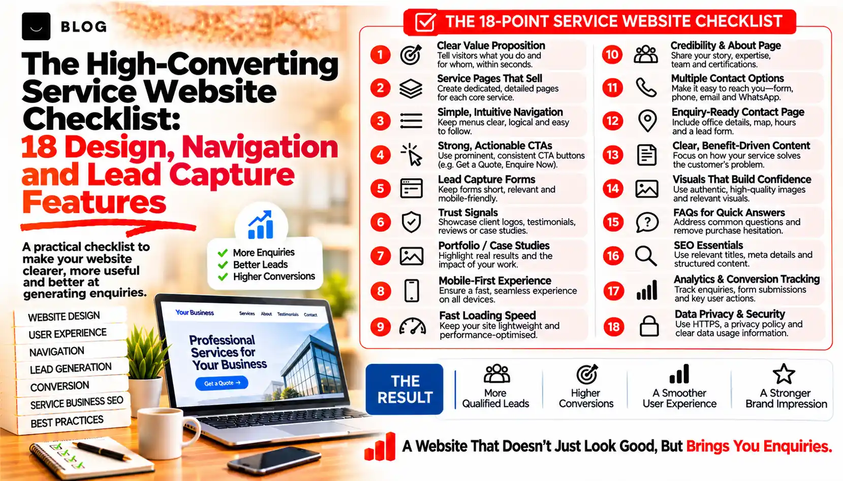
The High-Converting Service Website Checklist: 18 Design, Navigation and Lead Capture Features That Make Enquiries Easier
Most service websites do not lose enquiries because the service is poor. They lose them in small moments: a phone number that cannot be tapped, a form that asks for twelve details, a menu that hides the page the visitor wanted, a page that jumps around while it loads. Each one is minor. Together they send ready-to-buy visitors back to the search results.
A conversion checklist is useful because these problems are easy to overlook when you know your own site well. You know where everything is. A first-time visitor on a phone, in a hurry, does not.
This guide lists 18 features across five areas: first impression, navigation, trust and proof, lead capture, and testing. Each includes what to check and what to avoid. Nothing here promises a specific increase in enquiries, because results depend on your market, traffic and offer. The aim is to remove avoidable friction.
What a conversion checklist can and cannot do
It can reveal obstacles between a visitor's intent and their enquiry, and it gives you a short list of fixes you can make without redesigning the whole site.
It cannot make up for a weak offer, wrong traffic or slow follow-up. If the visitors are not your buyers, a better contact form will not help. Review the traffic sources and the way enquiries are handled as part of the same exercise, and test changes one at a time so you can tell what worked.
Part 1: The first impression
1. A headline that names the service, the audience and the place
Check: Read the top of your homepage for five seconds. A stranger should be able to say what you do, who it is for and where you work.
Avoid: Taglines such as "Excellence in everything" that describe no service at all.
2. One primary call to action, visible without scrolling
Check: Identify the single action you most want, such as "Request a quote" or "Book a consultation". Make it a clearly styled button on the first screen, on mobile as well as desktop.
Avoid: Five competing buttons of equal weight. Secondary options can sit lower.
3. Contact details in the header
Check: Show your phone number, opening hours and a way to enquire in the header. On mobile, make the number a tappable link that starts a call.
Avoid: Hiding contact details on a separate page that takes three clicks to reach.
4. A page that loads quickly and stays still
Check: Run your key pages through PageSpeed Insights. Web.dev's targets, measured on real visitors, are Largest Contentful Paint within 2.5 seconds, Interaction to Next Paint within 200 milliseconds and Cumulative Layout Shift of 0.1 or less.
Avoid: Large uncompressed images, pop-ups that push content around and sliders that load before the headline.
Part 2: Navigation that gets people to the right page
5. A short, plain-language menu
Check: Keep the main menu to a handful of items labelled with words visitors use, such as Services, About, Results and Contact.
Avoid: Clever labels like "Solutions" or "Our Journey" that hide where things are.
6. Service pages reachable in two clicks
Check: From the homepage, a visitor should reach any main service page within two clicks. Check your analytics to see whether visitors do.
Avoid: Putting every service on one long page, or nesting them so deeply that search engines and visitors give up.
7. A mobile navigation with an obvious way to contact you
Check: On a phone, make sure the menu opens easily and that a call, WhatsApp or enquiry button stays within reach as people scroll.
Avoid: A floating button that covers the content or the form fields.
8. Links between related pages
Check: Each service page should link to related services, relevant case studies and the enquiry page, using descriptive link text.
Avoid: Dead ends. A page with no next step loses visitors who were interested.
Part 3: Trust and proof
9. Real reviews with a visible source
Check: Show genuine ratings and reviews and say where they come from, with a link to the platform when possible.
Avoid: Anonymous or invented testimonials. They are easy to spot and may breach advertising rules.
10. Case studies with specifics
Check: Describe the problem, what you did and the outcome, with dates and permission from the client. Use real numbers only if you can trace them.
Avoid: Round, unsourced claims such as "doubled sales" with no context.
11. Credentials and associations
Check: Display relevant licences, accreditations, memberships and insurance, with registration numbers or verification links where possible.
Avoid: Badges you no longer hold or that cannot be checked.
12. Real people
Check: Show the names, roles and genuine photos of the people who will deal with the customer.
Avoid: Stock photos of smiling strangers and a "Meet the team" page with no names.
Part 4: Lead capture
13. A short enquiry form
Check: Ask only for what you need to reply: name, a way to contact the visitor and a short message. You can collect detail on the follow-up call.
Avoid: Long forms, mandatory fields that are not essential and captchas that frustrate real people.
14. More than one way to get in touch
Check: Offer the channels your customers actually use, such as phone, WhatsApp, email, form or online booking, and make each one work on mobile.
Avoid: Offering a channel you do not monitor. An unanswered chat widget is worse than none.
15. A clear next step after the enquiry
Check: After submission, show a confirmation message and send an email that says what happens next and when the visitor will hear from you.
Avoid: A form that reloads with no message, leaving the visitor unsure whether it worked.
16. Forms that are easy and accessible on a phone
Check: Use visible labels, the right keyboard for each field, helpful error messages and enough contrast and tap size. Test by completing the form on a phone with one hand.
Avoid: Placeholder text that disappears as soon as the visitor starts typing, and error messages that do not say what to fix.
Part 5: Measuring and maintaining
17. Tracking for every enquiry path
Check: Record form submissions, calls, WhatsApp taps and booking requests as separate events, and check that the numbers match the enquiries your team actually receives.
Avoid: Counting page views of a thank-you page that people can reach another way, or ignoring phone calls entirely.
18. A monthly test routine
Check: Once a month, submit a test enquiry through every route, check where it arrives and how fast someone replies, and test on at least one phone and one laptop. Also review spam filters to make sure real messages are not blocked.
Avoid: Assuming forms keep working after a plugin update or redesign. Broken forms often go unnoticed for weeks.
What to fix first
Sort the 18 items by effort and likely effect on a visitor who is ready to enquire.
| When | Items | Why |
|---|---|---|
| This week | 3, 13, 15, 17, 18 | Quick changes to contact details, form length, confirmation messages and tracking that remove obvious friction |
| This month | 1, 2, 4, 9, 10, 11, 12, 14, 16 | Content, proof and form improvements that need writing, photos or developer time |
| This quarter | 5, 6, 7, 8 | Navigation and structure changes that may need a wider site update |
How to test your changes
- Record a baseline. Note the number of visitors and enquiries by route for the last 30 to 60 days.
- Change one thing at a time. If you change the headline, form and menu together, you cannot tell which one helped.
- Compare enquiries per visit, not total enquiries. Traffic varies from week to week, and the rate removes much of that noise.
- Allow enough time. Low-traffic sites need weeks to show a pattern. Do not decide on a few days of data.
- Check enquiry quality. More enquiries are only an improvement if they are from the right people. Ask your team how the leads compare.
Common mistakes to avoid
Redesigning before fixing the basics. A new design with the same hidden phone number and long form will perform the same way.
Copying a competitor's layout. Their traffic, offer and customers may differ from yours.
Adding more pop-ups and widgets. Each one is another interruption. Add one only if it solves a real problem.
Ignoring mobile. For many local services most visits come from phones. Review every page there first.
Forgetting data protection. Collecting personal details usually brings legal duties, such as consent wording and privacy notices. Follow the rules that apply in your market.
Conclusion
A service website converts when it answers a visitor's questions quickly, proves that you are trustworthy and makes the next step simple. None of the 18 features is complicated. The difficulty is that they are easy to miss from the inside.
Start with this week's list, test one change at a time and keep a log of what you learn. Over a few months the improvements add up, and you will have your own evidence about what works for your audience.
If you would like an outside review of your website, Crescent Digital Solutions can assess your design, navigation and enquiry paths and give you a prioritised list of changes. We combine web development, SEO and performance marketing, so the recommendations cover both getting visitors and helping them enquire.
Frequently asked questions
As few as you need to reply. A name, a way to contact the visitor and a short message is enough for many service businesses. You can collect further details during the follow-up.
Yes, if phone calls are a route to enquiry for your business. Make the number a tappable link on mobile so one tap starts the call.
Only if someone can reply quickly during the hours it is shown. An unanswered chat widget frustrates visitors more than having no chat at all.
Web.dev's Core Web Vitals targets, measured on real visits, are Largest Contentful Paint within 2.5 seconds, Interaction to Next Paint within 200 milliseconds and Cumulative Layout Shift of 0.1 or less.
Track every enquiry route separately, make one change at a time and compare enquiries per visit before and after. Session recordings and form analytics can show where visitors hesitate or abandon the page.
Ready to build what's next?
Tell us where you're headed. We'll come back with a plan to get there.
Book an intro call