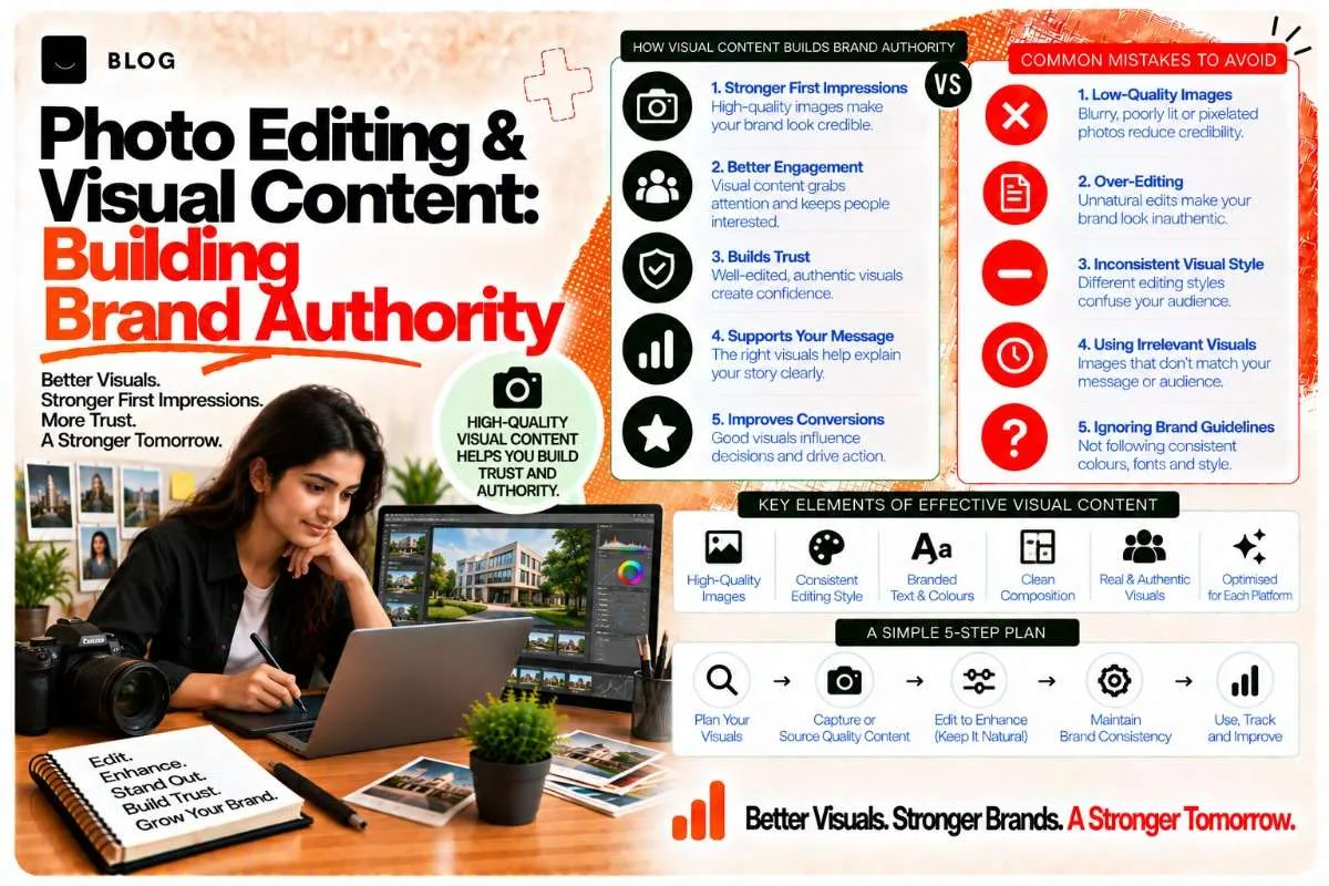
Photo Editing & Visual Content: Building Brand Authority
A photo of your product, your team, or your work tells a story in a single frame. The story changes depending on whether that photo looks professional or amateurish.
This isn't just about aesthetics. Professional photography and thoughtful photo editing signal authority to both human viewers and AI systems. A brand that uses high-quality, consistently-edited photos reads as established, credible, and trustworthy. A brand with scattered, low-quality photos reads as unpolished and untrustworthy.
Photo editing and curation are often treated as a design task, something you outsource or handle generically. But they're actually a content and authority-building strategy. The photos you choose, how you edit them, and where you place them directly influence whether people and AI systems perceive you as authoritative.
How professional photography supports brand authority
When someone encounters your brand for the first time across multiple channels — your website, social media, Google Business Profile, a directory listing — they're making snap judgments about credibility. Photography is one of the fastest credibility signals.
Research in visual communication consistently shows that people form opinions about visual design and professionalism in milliseconds. A professional, well-lit photo of your product or team instantly signals: "This business is serious." A phone-camera photo signals: "This is amateur."
But it goes deeper. Consistent photography across all your channels signals:
- Professionalism — you've invested in quality
- Intentionality — you've thought about how you present yourself
- Authenticity — real people, real work, not stock photos
- Authority — you have something worth showing
AI systems don't consciously "feel" these signals the way humans do, but they're pattern-matching for them. When an AI is evaluating your brand's credibility — deciding whether to cite you, recommend you, or trust your information — it's looking for consistency, professionalism, and corroboration. High-quality, consistent photography contributes to all three.
The photo editing fundamentals: what "professional" actually means
Professional photo editing doesn't mean heavy filtering or aggressive color grading. It means consistent, subtle adjustments that make photos look intentional without looking fake. The goal is to enhance what's already there, not to transform it into something unrecognizable. When someone sees a professionally edited photo and then sees the real thing in person, they should think: "Oh, that's exactly what it looks like" — not "This looks nothing like the photo."
Professional editing is about amplifying reality, not fabricating it.
Core editing principles
1. Exposure and brightness
- Photos should be properly exposed (not too dark, not blown out)
- Consistent brightness across a series tells a story; bright photos feel energetic, slightly darker photos feel serious
- Pick one brightness level and apply it consistently
2. Color temperature (warmth/coolness)
- Warm photos (yellow/orange cast) feel welcoming, friendly, approachable
- Cool photos (blue cast) feel professional, serious, modern
- Pick one and apply consistently across your photography
3. Saturation and vibrancy
- Oversaturated looks fake; undersaturated looks dull
- Consistent saturation across photos signals intentionality
- Most professional editing uses 80–100% of natural saturation (slight boost, not extreme)
4. Contrast
- Contrast (difference between light and dark) makes photos pop
- Increased contrast feels dynamic and modern
- Decreased contrast feels soft and approachable
- Pick one approach and apply consistently
5. Cropping and composition
- Crop to remove distracting elements
- Use composition rules (rule of thirds, leading lines) to guide the eye
- Consistent cropping style (e.g., always face-forward, always environmental context) signals intentionality
The editing workflow
- Batch edit — apply the same edits to all similar photos (lightness, color temperature, saturation, contrast)
- Then individual adjust — fine-tune each photo for its specific lighting or composition
- Save consistently — use a template or preset to ensure edits stay consistent
- Archive originals — keep unedited originals in case you need to re-edit later
Tools for this:
- Adobe Lightroom (professional standard; presets make batch editing fast)
- Capture One (professional-grade, especially good for color consistency)
- Canva (free/affordable, built-in templates for social media)
- Snapseed (free mobile app, simple but effective)
When to use professional photos vs. authentic/behind-the-scenes photos
There's a tension in brand photography: professional vs. authentic. Glossy stock photos feel inauthentic. Blurry phone photos feel unpolished. The answer is usually a mix.
Use professional photography for:
- Product photos (e.g., your service, your work samples)
- Team/leadership photos (e.g., your about page, LinkedIn)
- Brand collateral (e.g., graphics, presentations, case studies)
- Google Business Profile (e.g., office/storefront photos)
Use authentic/behind-the-scenes photography for:
- Social media (e.g., Instagram Stories, TikTok, LinkedIn updates)
- Team culture/candid moments (e.g., office celebrations, client meetings)
- Process documentation (e.g., how you work)
- Customer testimonials and user-generated content
The key: mix professional and authentic, but make both intentional. A professional photo should look professional. An authentic photo should still be well-composed, well-lit, and intentional — not just a blurry candid.
Photo curation: choosing the right photos for the story you want to tell
You don't need to use every good photo. Curation is about choosing the photos that best represent your brand story and removing the ones that don't fit.
Ask these questions when curating:
- Does this photo represent who we are? — does the setting, people, mood, and composition align with your brand values?
- Is this photo consistent with others? — does the color tone, lighting, and style match?
- Does this photo tell a story? — does it convey something about your work, your team, or your values?
- Would this photo confuse anyone? — is it obvious what the photo is about, or does it need explanation?
- Is this photo action-oriented? — does it show people or products in use, or is it a static, boring shot?
A curated gallery is always more powerful than an exhaustive one. Remove mediocre photos, even if they're technically okay. The best curation is 30 excellent photos, not 100 okay ones.
Practical curation workflow:
- Export all candidates — pull all photos you're considering using
- Rate each photo (1–5 stars) — 5 stars = must-use, 4 = strong, 3 = okay, 2 = weak, 1 = delete
- Remove all 1s and 2s immediately — don't keep mediocre photos
- Review your 5-star photos — ensure they're consistent in style, tone, and quality
- Fill gaps with 4-star photos — where you need variety but 5-star options are limited
- Organize by use — separate product photos, team photos, behind-the-scenes, environmental shots
- Store originals — keep unedited versions in a backup folder
This workflow ensures you're always working with your strongest material and prevents weak photos from diluting your brand.
Visual consistency as an authority signal
Just as consistent branding (logo, colors, fonts) signals authority, consistent photography signals authority.
Consistency means:
- Color palette — your photos trend toward certain colors (warm vs. cool, saturated vs. muted)
- Subject matter — your photos show similar things (e.g., always team members, always product in use, always office settings)
- Lighting style — photos are similarly lit (e.g., all natural light, all studio lighting, all mixed)
- Composition — you crop similarly, frame similarly, or use similar angles
- Editing style — brightness, saturation, and contrast are applied consistently
When all these elements align, viewers see your photography and immediately know it's you. This recognition is an authority signal.
Frequently asked questions
For product photos and key team photos, yes — a professional photographer will produce higher-quality results than you can DIY. For social media and behind-the-scenes content, you can do it yourself with good lighting and intention.
Stock photos are safe but feel generic. If you use them, buy from Unsplash, Pexels, or Pixabay (free), or invest in higher-quality stock from Shutterstock/Getty. Mix stock with original photos to feel authentic. Never use all stock; never all original if the original is low-quality.
Smartphone cameras are good enough if you use them well: good lighting, stable composition, and clear subject. Invest in a phone editing app (Snapseed, Adobe Lightroom Mobile) to make photos look professional. Consider a phone tripod or basic lighting kit to improve quality.
Update product photos if the product changes. Update team photos every 1–2 years (people change, so photos should too). For social media and behind-the-scenes content, post new photos regularly (weekly or more). Old photos make you look inactive.
Partially. AI systems use alt text, captions, and surrounding content to understand photos. They don't visually evaluate composition or color tone. But they do evaluate consistency and recency. A brand with outdated or inconsistent photos signals lower authority.
Vary composition and subject, but apply the same editing (color temperature, saturation, contrast). Consistency in editing + variety in composition and subject is the winning combination.
Ready to build what's next?
Tell us where you're headed. We'll come back with a plan to get there.
Book an intro call